Creating the Flex Wrapper
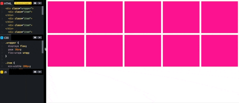
First of all, we need to create the flex wrapper. We only need some basic css properties. Most important is the flex-wrap property, which will allow the items to wrap if they overflow. I’ll add gap as well to add some nice spacing.
.wrapper {
    display: flex;
    flex-wrap: wrap;
    gap: 16px;
}
Creating the Items
The items only need two properties to create a responsive effect; min-width and flex.
.item {
    min-width: 250px;
    flex: 1;
}
The min-width is needed to put some restrictions on the items, not making them smaller than the specified width. Setting flex to 1, which is shorthand for flex: 1 1 0%, actually does three things.
- Setting
flex-growto 1, allowing the item to grow if needed. - Setting
flex-shrinkto 1, allowing the item to shrink if needed. However, as we have defined a min-width, it won’t be smaller than that. - Setting
flex-basisto 0%, which will set the “ideal” size for the item.
Here is an example of how it looks: